Get your website mobile ready
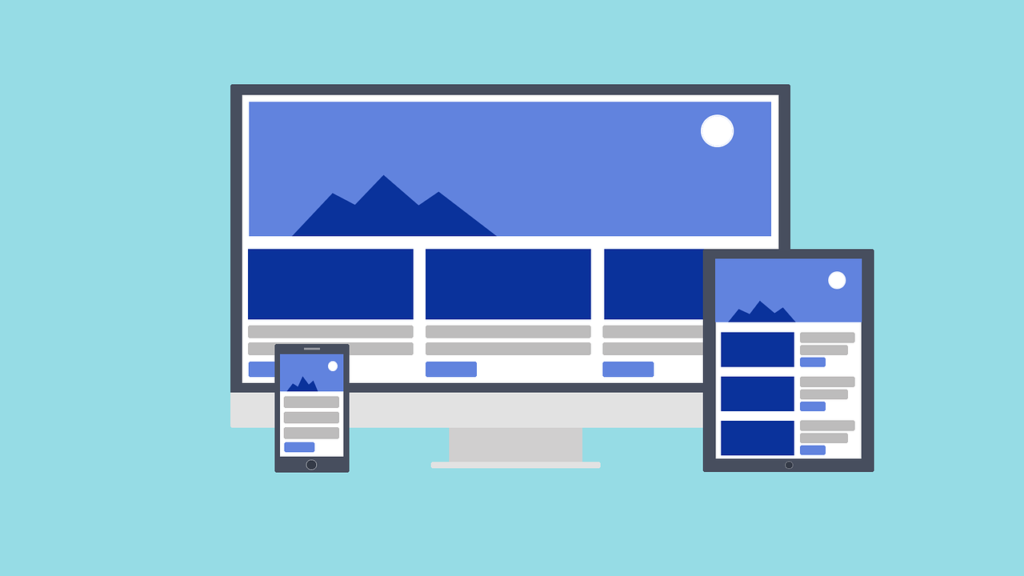
NearSource is focused on developing mobile friendly websites. It is important that your website works well on mobile devices. It is harder to show up on search engines if your website is not mobile ready.
There are several options to get your website to work on mobile devices depending on what you want to do and what is your budget. Some clients prefer to make their website fully responsive where each page adapts to the mobile device. This is probably the best option to be able to show all of your content for search engine optimization. Other clients prefer to create a mobile version of their website geared to their mobile audience showing only the most important and relevant information. Other options are using 3rd party services or plugins that automatically create a mobile version of your page. NearSource can work with you to understand what your goals are and implement the solution that is best for your needs and budget.
Mobile Friendly Website Development Options & Services
- Fluid Design for 100% responsiveness for all browser/device sizes
- Responsive design for specific pages and content to show mobile ready content only
- Mobile ready navigation menus
- WordPress theme updates
- WordPress 3rd party plugins and services integration